VITEPE
Deals That Find You
Vitepe – Reimagining Hyperlocal Food Offers
Helping students and food lovers find instant, location-based restaurant offers across Canada.
Web Platform
Foodtech


What is Vitepe?
Vitepe is a real-time, hyperlocal food offer discovery platform focused on helping users find active deals from restaurants, food trucks, cafés, and hotels near them. Originally built to serve a broader vendor base — including salons, florists, and convenience stores — this upgraded version marks a strategic pivot to focus solely on food.
This change was driven by both market insights and the need to provide deeper value in a specific niche. Our role at Tikanga was to reshape the entire experience, streamline the platform’s goals, and launch a stronger, more focused product that appeals to a high-intent user base.
Challenges
The key challenges in upgrading Vitepe involved repositioning it from a broad platform to a niche food focus, necessitating a complete rethink of user experience and platform goals. This included a UI/UX redesign for appealing and usable food offer discovery, along with optimising user and merchant flows. We also faced the task of complete frontend and backend development for a scalable infrastructure, implementing QR-based offer redemption, and creating an SEO-optimised architecture. Developing intuitive admin and merchant dashboards and ensuring thorough testing for launch readiness were critical. Furthermore, standing out in a saturated market required delivering a seamless offer experience with a fast interface, while also enabling future vendor monetisation and ensuring backend flexibility for feature rollouts.
Our Solution
Tikanga addressed these challenges through a focused UI/UX redesign tailored for food offers and streamlined user and merchant flow optimisation. Our approach included robust frontend and backend development, the implementation of a secure QR code system for offer redemption, and the creation of an SEO-optimised platform architecture. We also developed intuitive admin and merchant dashboards and ensured comprehensive testing for a smooth launch. Our market-informed design prioritised a seamless and fast user experience, supported by a scalable backend built for future monetisation and feature integration.
User Flow
We simplified the experience into a few clear paths:
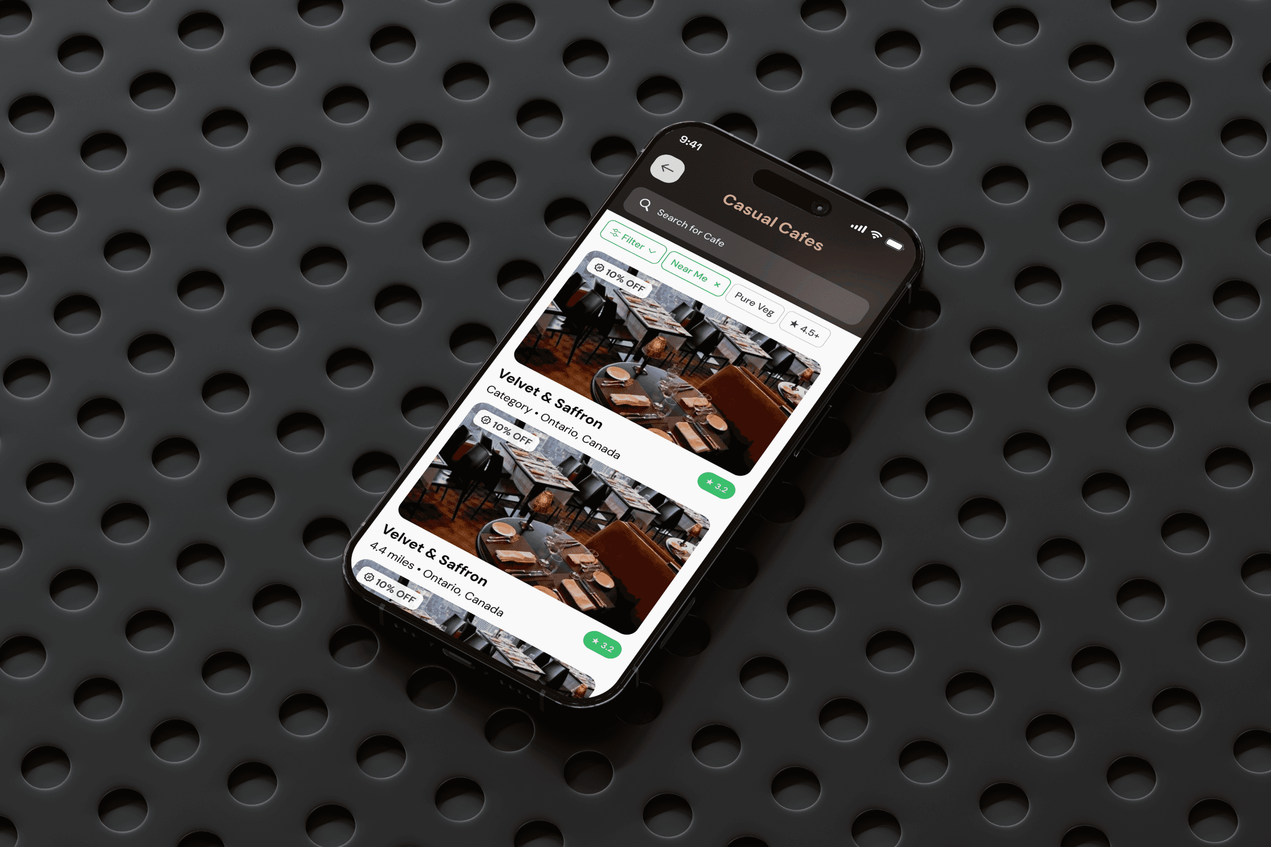
Users: Browse offers → Visit → Scan QR → Redeem
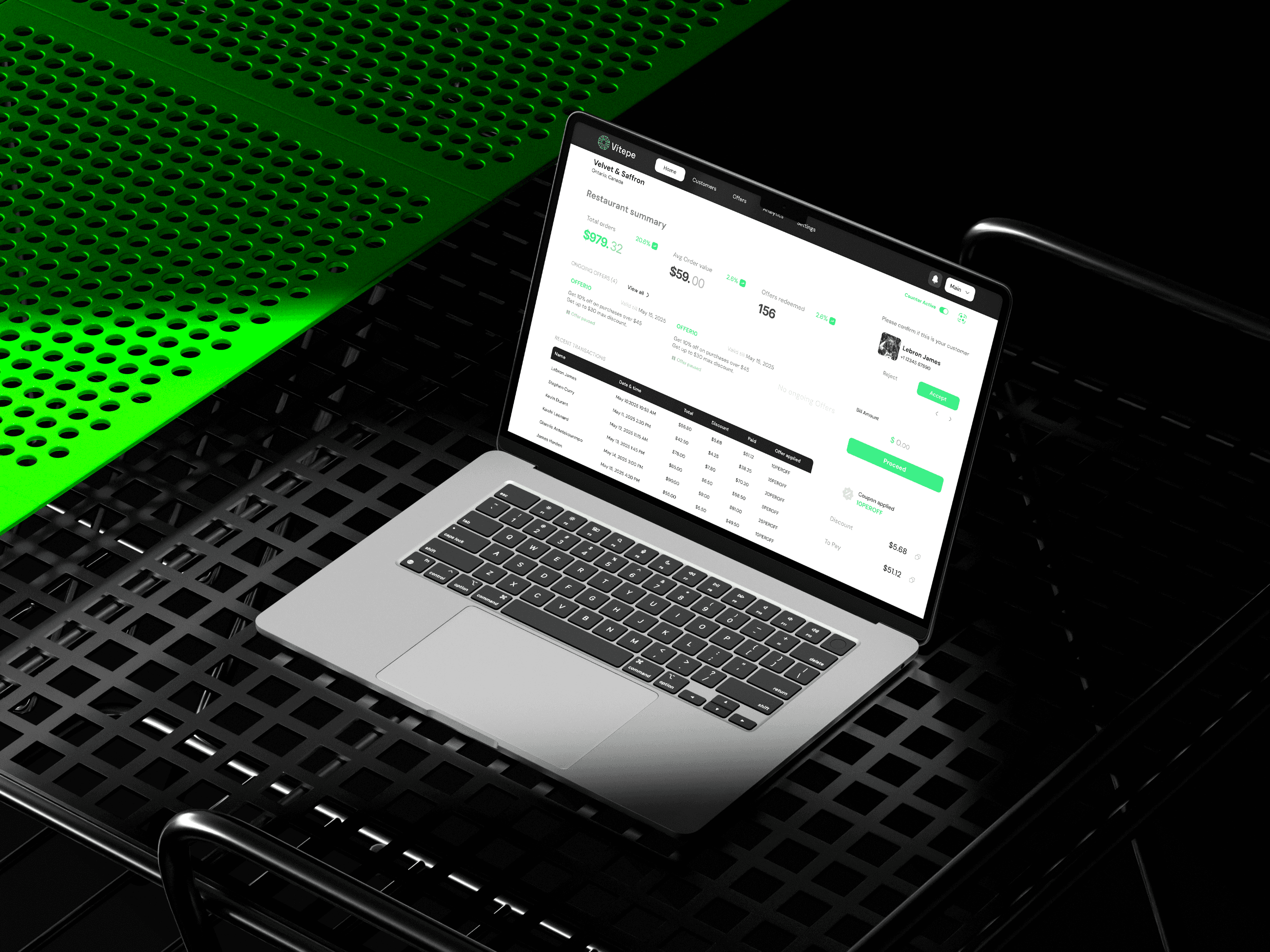
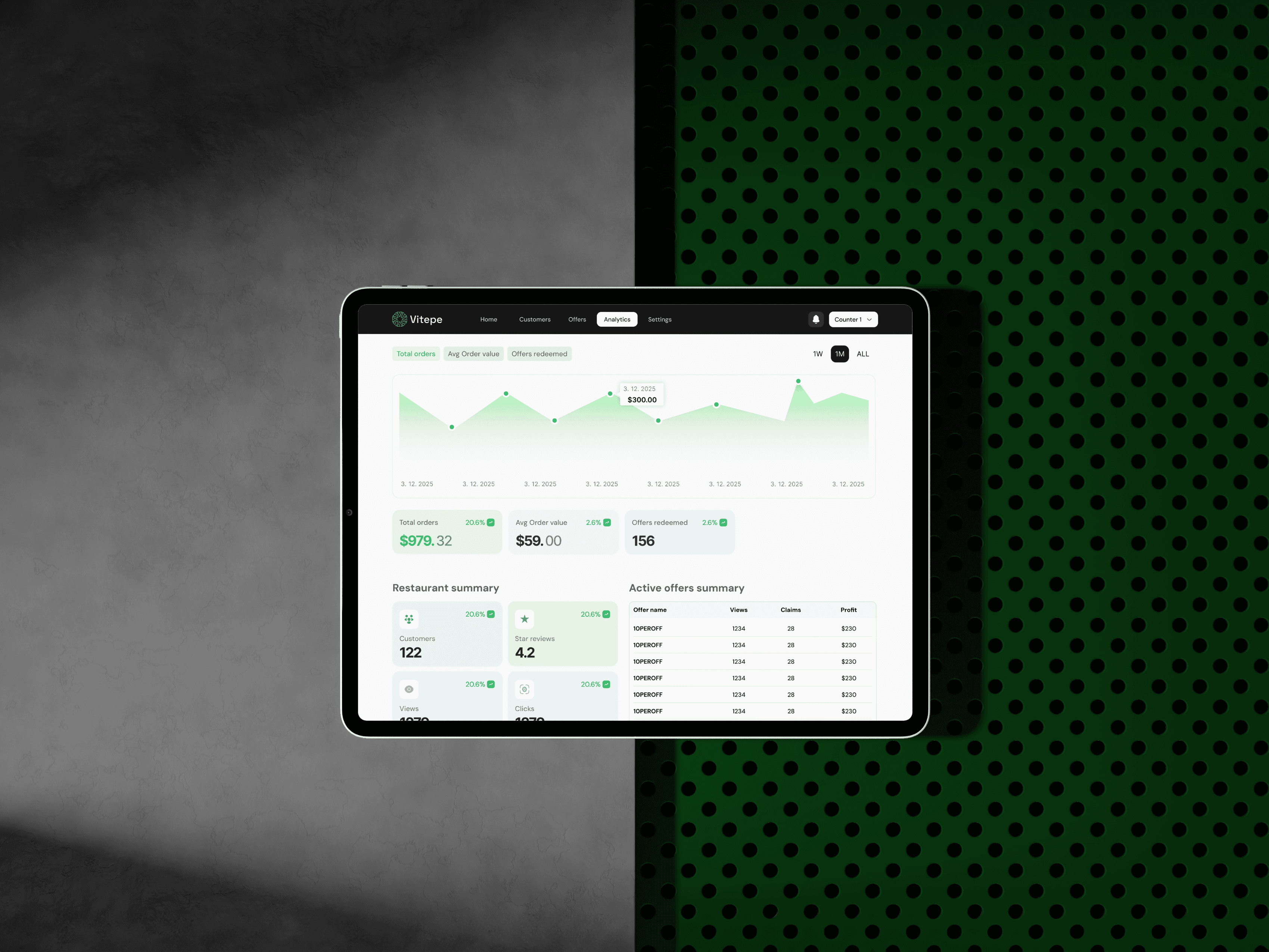
Merchants: Create offer → Track views/claims → Access basic analytics
This clarity helped reduce drop-offs and ensured instant comprehension, especially for non-tech-savvy users.

Execution Process – Building Vitepe, Step by Step
The execution of Vitepe’s transformation wasn’t a linear path — it was an agile, collaborative evolution. From the first discovery call to final launch, Tikanga approached every phase with a mix of design thinking, user empathy, and future-forward tech planning. We knew from the beginning that the goal wasn’t just to create a beautiful interface but to build a product that feels intuitive, performs seamlessly, and scales intelligently.
Discovery & Strategy Alignment
We kicked things off with a thorough audit of the existing platform. This included a breakdown of user behavior patterns, app performance metrics, and direct competitor mapping. We found that while Vitepe’s foundation was promising, the experience lacked focus. The pivot to a food-only ecosystem gave us the clarity we needed to redesign both the user journey and the technical stack with precision.
This is where we redefined the brand voice, design tone, and content style. A new design system was created from scratch—centered around light UI elements, shades of green (to represent freshness and savings), and an overall clean interface designed to minimize friction.
Moodboarding & Wireframing
Once we locked in the brand direction, we created a moodboard that captured the vision—bright, approachable, and modern. We made conscious decisions to avoid dark, saturated themes which are commonly used in food apps. Instead, Vitepe needed to feel distinct yet accessible, particularly for our student and working professional audience.
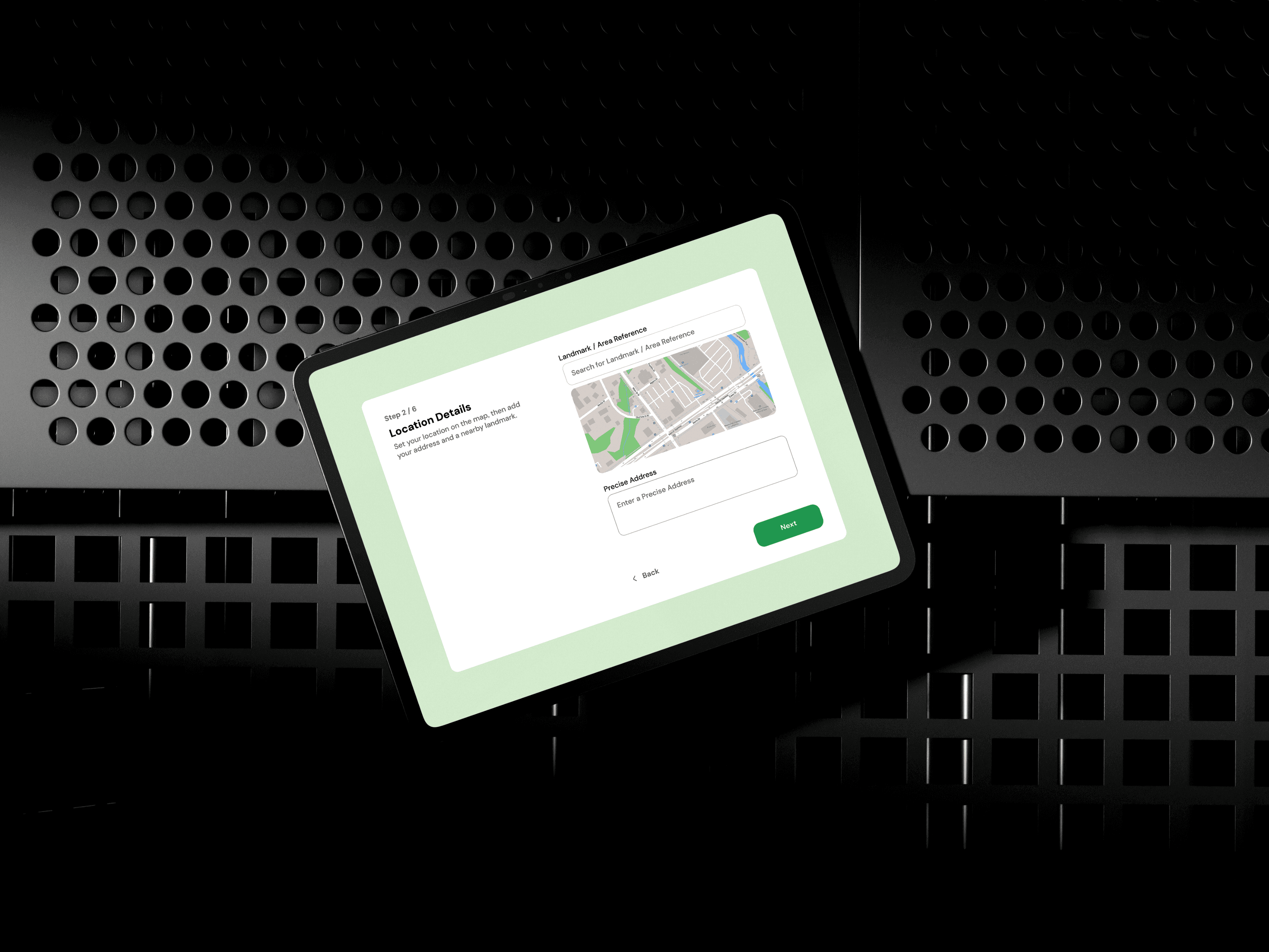
Our wireframing process was agile—starting from basic screen flows to interaction models for the QR redemption system. These wireframes helped us validate layout logic, test with a few pilot users, and refine early on.

UI Design & Microinteractions
With the structure solidified, our design team translated the wireframes into pixel-perfect UI. Every component was designed with scalability and responsiveness in mind. Buttons, cards, and modals were made reusable using a Figma-based design system, enabling faster development handoff.
We also integrated microinteractions for small yet delightful moments—animations while scanning a QR, visual confirmations when an offer is claimed, and smooth transitions between screens—all contributing to a sense of polish and trust.
Development Phase
The frontend was built in React (Next.js) with an emphasis on performance and PWA capabilities for fast access. Backend APIs were structured using Node.js and Express, with a scalable architecture that could later support merchant-side analytics, custom ad campaigns, and admin controls.
Special care was taken to ensure:
QR-based offer redemption is secure, fast, and verifiable
Location services are optimized without draining device battery
Data sync happens in real-time for both users and merchants
We also implemented basic ad support within the merchant dashboard, which allows them to promote their offers within the app. Though basic in this phase, the backend is architected to eventually support campaign management, target audience filters, and budget controls.
Testing, Feedback, and Iterations
We conducted usability testing with 15+ users, including both merchants and customers. This helped us catch minor friction points — like QR scan accuracy, time delays, and button placements. These sessions gave us actionable insights, which were quickly integrated into our next sprint.
We used tools like Postman, BrowserStack, and Firebase Crashlytics for QA and performance monitoring during beta release. The goal was clear: zero crashes, fast load times, and instant redemption flow.
Launch & Post-Launch Optimization
Once the app was live, we didn’t stop. We continued to monitor heatmaps, behavior data, and merchant activity to identify optimization opportunities. From adding onboarding tooltips to tweaking merchant visibility rules, every post-launch action was insight-driven.
Tech Stack
Frontend: React.js (Web Application)
Backend: Node.js with Express.js
Database: MongoDB
Hosting: AWS (Amazon Web Services)
Authentication: JWT Authentication System
Payment Gateway: Stripe Integration
Real-Time Communication: Firebase (for real-time updates and notifications)
File Storage: AWS S3 Buckets
Security Measures: SSL Certification, Basic OWASP Compliance
Analytics & Tracking: Google Analytics, Facebook Pixel Integration

Why We Made These Decisions
Our design and tech choices weren’t arbitrary — they were based on intent and evidence.
Focused on food: Specializing in one category builds stronger recall and brand alignment
QR-based redemption: Eliminates fraud, ensures real footfall, and builds trust with merchants
Text-based menus: Better performance, accessibility, and ranking over PDF uploads
Light design with green tones: Fresh, inviting, and different from noisy competitors
Merchant ads via dashboard (in future): A scalable revenue stream in version 3
Conclusion
Vitepe’s transformation isn’t just visual — it’s foundational. By narrowing its focus, improving usability, and baking in performance and scalability, we helped create a food-only offer app that doesn't just work — it works better than what’s out there.
At Tikanga, we don’t just deliver digital products — we engineer experience, design for clarity, and build with foresight. Vitepe reflects that belief from first tap to final redemption.
More Other cases


How We Work?